Seaborn#
Seaborn is a Python data visualisation library based on Matplotlib. Some tasks are a bit cumbersome to perform using just Matplotlib, such as automatically plotting one numeric variable vs. another numeric variable for each level of a third (categorical) variable. Using Matplotlib functions behind the scenes, Seaborn provides an easy-to-use syntax to perform such tasks.
An additional benefit of Seaborn is that it works natively with Pandas dataframes, which is not the case for Matplotlib. This tutorial provides a brief overview of Seaborn for basic data visualisation.
Table of Contents#
The BRFSS Dataset#
The dataset used in this tutorial is collected by the Centers for Disease Control and Prevention (CDC). As explained here, the Behavioral Risk Factor Surveillance System (BRFSS) is an annual telephone survey of 350,000 people in the United States. As its name implies, the BRFSS is designed to identify risk factors in the adult population and report emerging health trends. For example, respondents are asked about their diet and weekly physical activity, their HIV/AIDS status, possible tobacco use, and even their level of healthcare coverage. The BRFSS website contains a complete description of the survey, including the research questions that motivate the study and many interesting results derived from the data. We will focus on a random sample of 20,000 people from the BRFSS survey conducted in 2000. While there are over 200 variables in this data set, we will work with a small subset.
The variables in the dataset are genhlth, exerany, hlthplan, smoke100, height, weight, wtdesire, age, and gender. Each one of these variables corresponds to a question that was asked in the survey. For example, for genhlth, respondents were asked to evaluate their general health, responding either excellent, very good, good, fair or poor. The exerany variable indicates whether the respondent exercised in the past month (1) or did not (0). Likewise, hlthplan indicates whether the respondent had some form of health coverage (1) or did not (0). The smoke100 variable indicates whether the respondent had smoked at least 100 cigarettes in her lifetime. The other variables record the respondent’s height in inches, weight in pounds as well as their desired weight, wtdesire, age in years, and gender.
We begin by importing necessary modules and setting up Matplotlib environment followed by importing the dataset from the Cloud.
import random
import numpy as np
import pandas as pd

import warnings
warnings.filterwarnings('ignore')

# import the pyplot module from the the matplotlib package
import matplotlib.pyplot as plt
%matplotlib inline
%config InlineBackend.figure_format = 'retina'
plt.style.use("seaborn-v0_8")

import seaborn as sns
sns.set()
import warnings

warnings.filterwarnings("ignore")

import io
import requests

# so that we can see all the columns
pd.set_option("display.max_columns", None)

# how to read a csv file from a github account
url_name = "https://raw.githubusercontent.com/akmand/datasets/master/cdc.csv"
url_content = requests.get(url_name, verify=False).content
cdc = pd.read_csv(io.StringIO(url_content.decode("utf-8")))
cdc.describe(include="all")
| genhlth | exerany | hlthplan | smoke100 | height | weight | wtdesire | age | gender | |
|---|---|---|---|---|---|---|---|---|---|
| count | 20000 | 20000.000000 | 20000.000000 | 20000.000000 | 20000.000000 | 20000.00000 | 20000.000000 | 20000.000000 | 20000 |
| unique | 5 | NaN | NaN | NaN | NaN | NaN | NaN | NaN | 2 |
| top | very good | NaN | NaN | NaN | NaN | NaN | NaN | NaN | f |
| freq | 6972 | NaN | NaN | NaN | NaN | NaN | NaN | NaN | 10431 |
| mean | NaN | 0.745700 | 0.873800 | 0.472050 | 67.182900 | 169.68295 | 155.093850 | 45.068250 | NaN |
| std | NaN | 0.435478 | 0.332083 | 0.499231 | 4.125954 | 40.08097 | 32.013306 | 17.192689 | NaN |
| min | NaN | 0.000000 | 0.000000 | 0.000000 | 48.000000 | 68.00000 | 68.000000 | 18.000000 | NaN |
| 25% | NaN | 0.000000 | 1.000000 | 0.000000 | 64.000000 | 140.00000 | 130.000000 | 31.000000 | NaN |
| 50% | NaN | 1.000000 | 1.000000 | 0.000000 | 67.000000 | 165.00000 | 150.000000 | 43.000000 | NaN |
| 75% | NaN | 1.000000 | 1.000000 | 1.000000 | 70.000000 | 190.00000 | 175.000000 | 57.000000 | NaN |
| max | NaN | 1.000000 | 1.000000 | 1.000000 | 93.000000 | 500.00000 | 680.000000 | 99.000000 | NaN |
cdc.sample(10, random_state=999)
| genhlth | exerany | hlthplan | smoke100 | height | weight | wtdesire | age | gender | |
|---|---|---|---|---|---|---|---|---|---|
| 6743 | very good | 1 | 1 | 0 | 71 | 170 | 170 | 23 | m |
| 19360 | very good | 1 | 0 | 1 | 64 | 120 | 117 | 45 | f |
| 8104 | good | 1 | 1 | 1 | 70 | 192 | 170 | 64 | m |
| 8535 | excellent | 1 | 1 | 1 | 64 | 165 | 140 | 67 | f |
| 8275 | very good | 1 | 1 | 0 | 69 | 130 | 140 | 69 | m |
| 3511 | very good | 0 | 1 | 0 | 63 | 128 | 128 | 37 | f |
| 1521 | good | 1 | 1 | 0 | 68 | 176 | 135 | 37 | f |
| 976 | fair | 0 | 1 | 1 | 64 | 150 | 125 | 43 | f |
| 14484 | good | 1 | 1 | 1 | 68 | 185 | 185 | 78 | m |
| 3591 | fair | 1 | 1 | 0 | 71 | 165 | 175 | 34 | m |
cdc.info()
<class 'pandas.core.frame.DataFrame'>
RangeIndex: 20000 entries, 0 to 19999
Data columns (total 9 columns):
 #   Column    Non-Null Count  Dtype
---  ------    --------------  -----
 0   genhlth   20000 non-null  object
 1   exerany   20000 non-null  int64
 2   hlthplan  20000 non-null  int64
 3   smoke100  20000 non-null  int64
 4   height    20000 non-null  int64
 5   weight    20000 non-null  int64
 6   wtdesire  20000 non-null  int64
 7   age       20000 non-null  int64
 8   gender    20000 non-null  object
dtypes: int64(7), object(2)
memory usage: 1.4+ MB
Let’s get a value count for each one of the categorical variables.
categorical_cols = cdc.columns[cdc.dtypes == object].tolist()
for col in categorical_cols:
    print(f"Column Name: {col}")
    print(cdc[col].value_counts())
    print("\n")
Column Name: genhlth
genhlth
very good    6972
good         5675
excellent    4657
fair         2019
poor          677
Name: count, dtype: int64


Column Name: gender
gender
f    10431
m     9569
Name: count, dtype: int64
Scatter Plots#
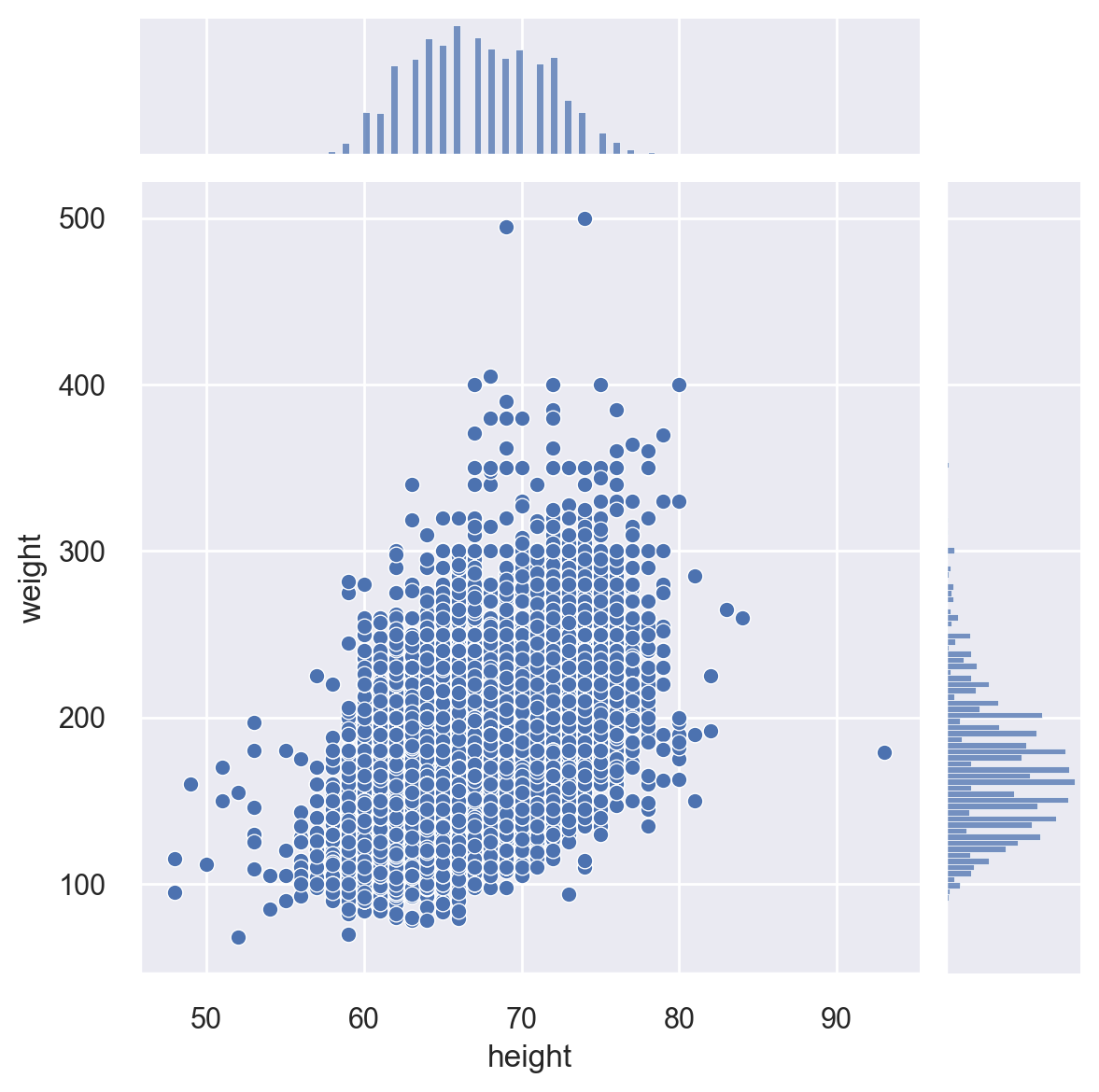
Let’s first plot height vs. weight in the dataset with both univariate and bivariate plots.
sns.jointplot(x="height", y="weight", data=cdc)
<seaborn.axisgrid.JointGrid at 0x10ed33b10>
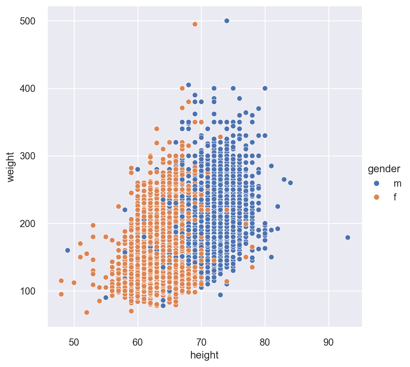
Let’s again plot height vs. weight, but this time, let’s break this by gender. For this task, we use the relplot(), which is a workhorse function in Seaborn. The default option with this function is “scatter’. You can change this by setting the kind option to “line” in order to get a line plot. Notice the height option below to make the plot slightly bigger. The hue option specifies how to color the data points.
sns.relplot(x="height", y="weight", hue="gender", height=6, data=cdc)
<seaborn.axisgrid.FacetGrid at 0x10efec490>
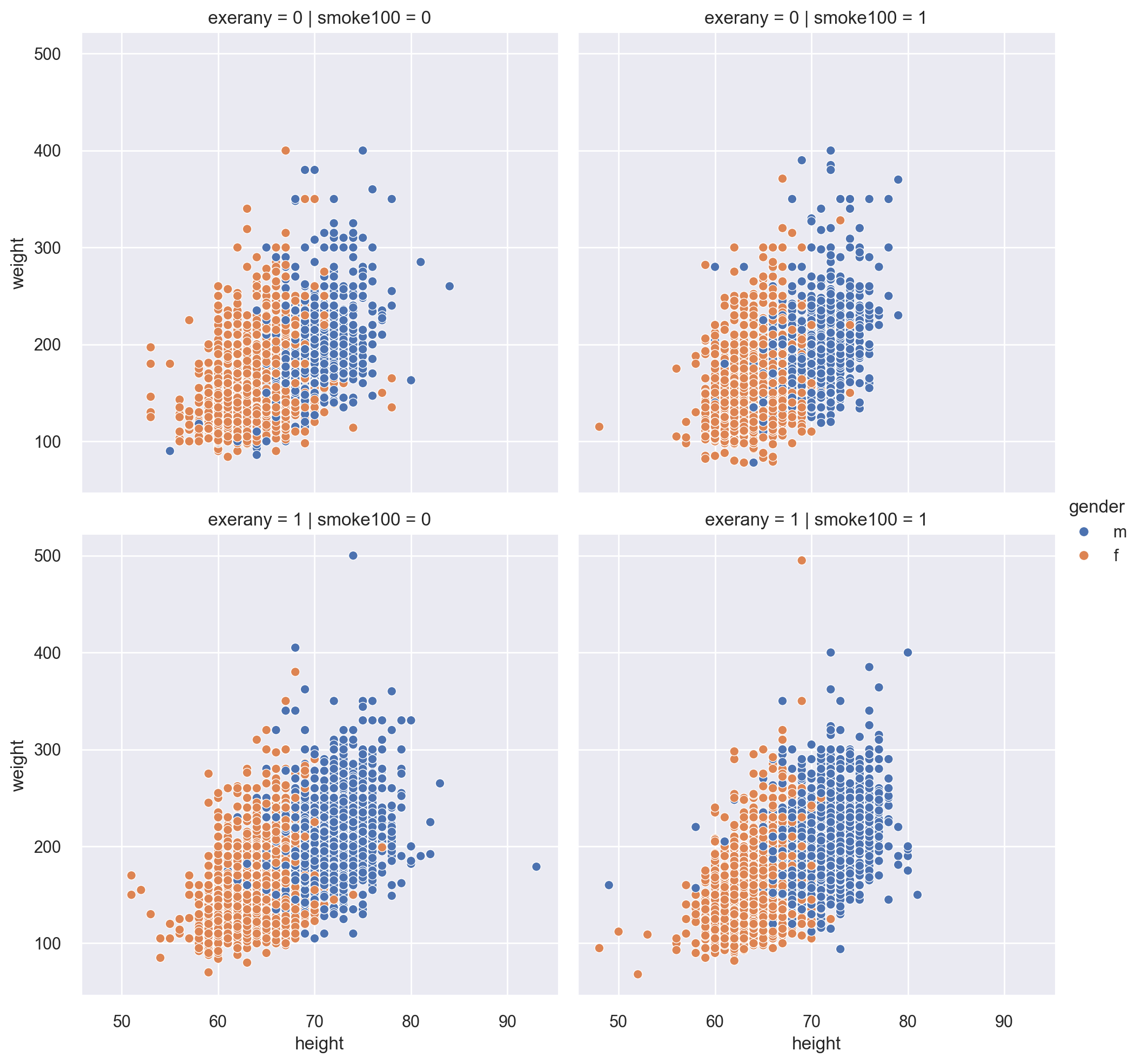
We are curious if the above plot would be different for smokers vs. nonsmokers as well as respondents who exercised in the past month vs. who did not. For this, we use the col and row options.
This kind of plot is called a facetted plot.
sns.relplot(
    x="height", y="weight", hue="gender", col="smoke100", row="exerany", data=cdc
)
<seaborn.axisgrid.FacetGrid at 0x10f079f50>
Boxplots#
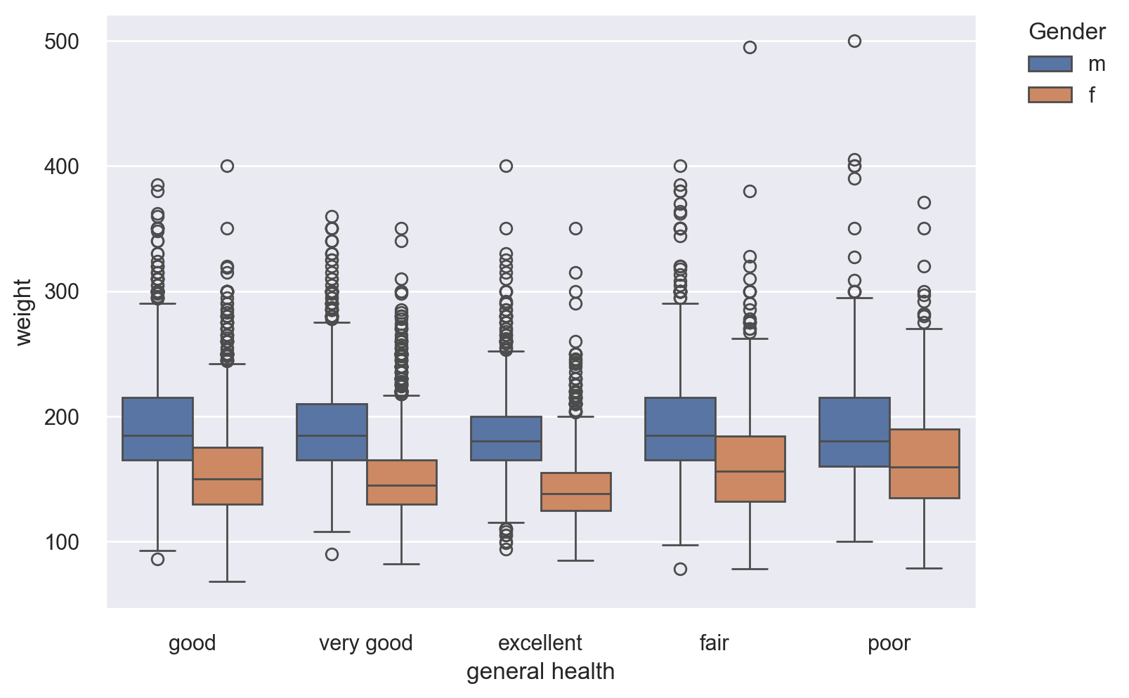
We would like to visualize the distribution of weights of the respondents, its quartiles and outliers (if any) with respect to each gender. For this, we need a boxlot. Keep in mind that the “box” in the middle contains exactly 50% of the respective data subset.
Do you see anything different with the people who are in excellent health?
bp = sns.boxplot(x="genhlth", y="weight", hue="gender", data=cdc)

# position the legend outside the chart
bp.legend(bbox_to_anchor=(1.05, 1), loc=2, borderaxespad=0.0, title="Gender")

# set the x-axis title
bp.set_xlabel("general health")
Text(0.5, 0, 'general health')
Histograms#
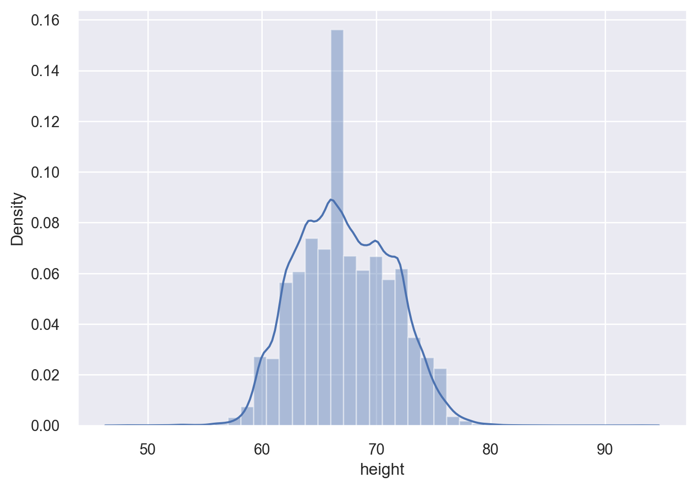
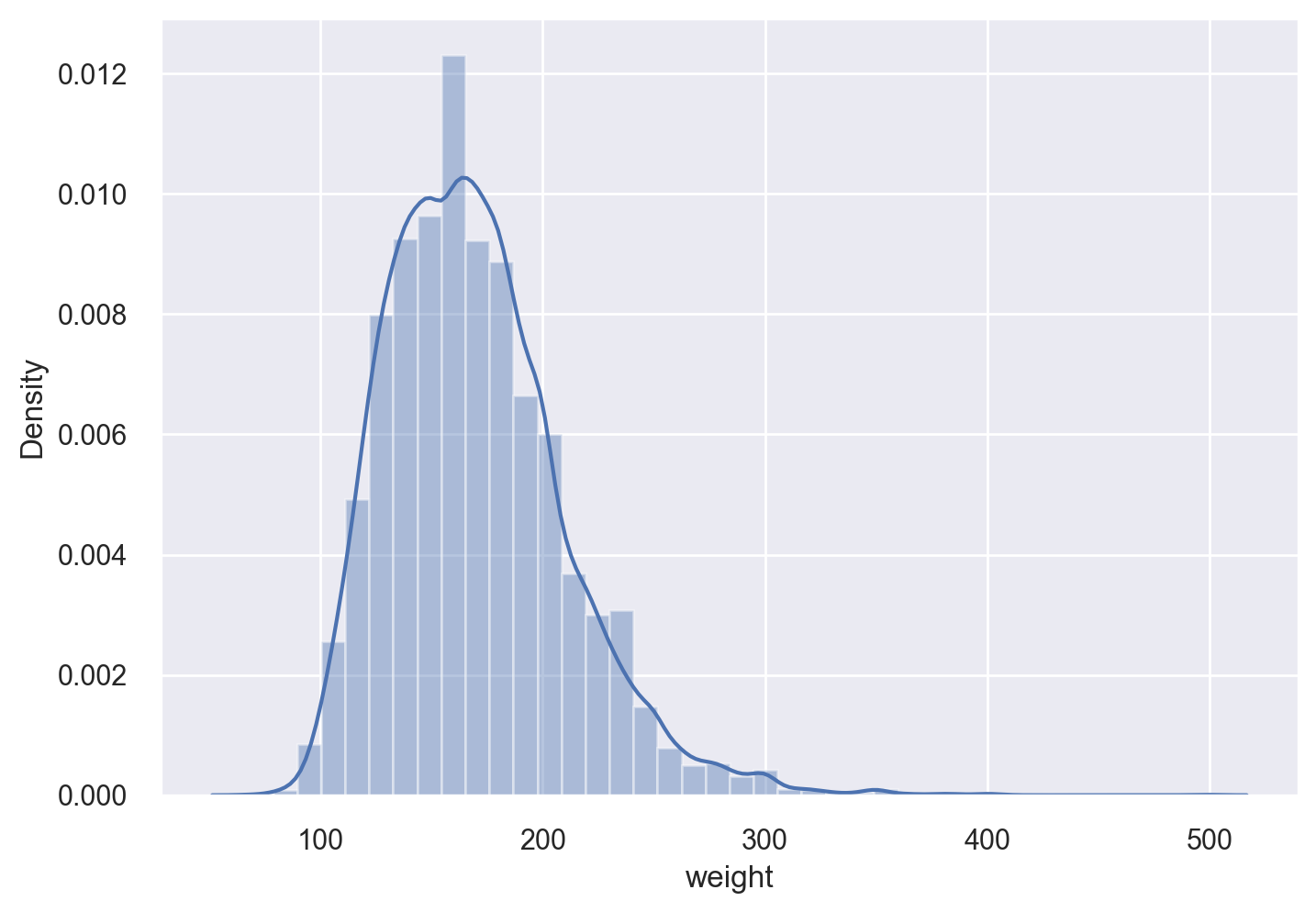
Let’s get a histogram of the heights and weights of the survey respondents. For both histogtams, we will overlay the kernel density estimate (KDE).
sns.distplot(cdc["height"], kde=True, bins=40)
<Axes: xlabel='height', ylabel='Density'>
sns.distplot(cdc["weight"], kde=True, bins=40)
<Axes: xlabel='weight', ylabel='Density'>
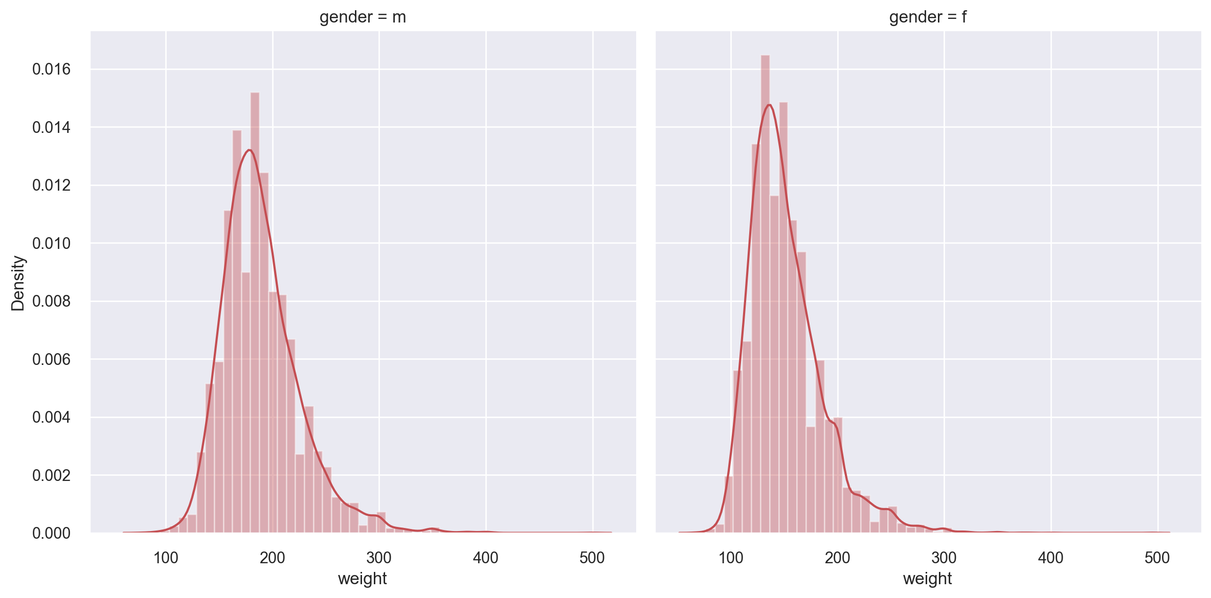
Let’s get a histogram of weights of the respondents, this time across the gender dimension as a faceted histogram.
s = sns.FacetGrid(cdc, height=6, col="gender")

s = s.map(sns.distplot, "weight", color="r")
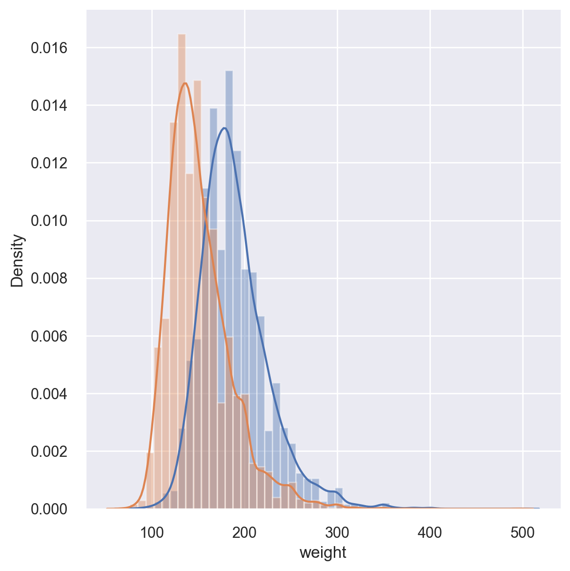
It might also be a good idea to overlay the weight distribution for males and females in the same plot.
s = sns.FacetGrid(cdc, height=6, hue="gender")

s = s.map(sns.distplot, "weight")
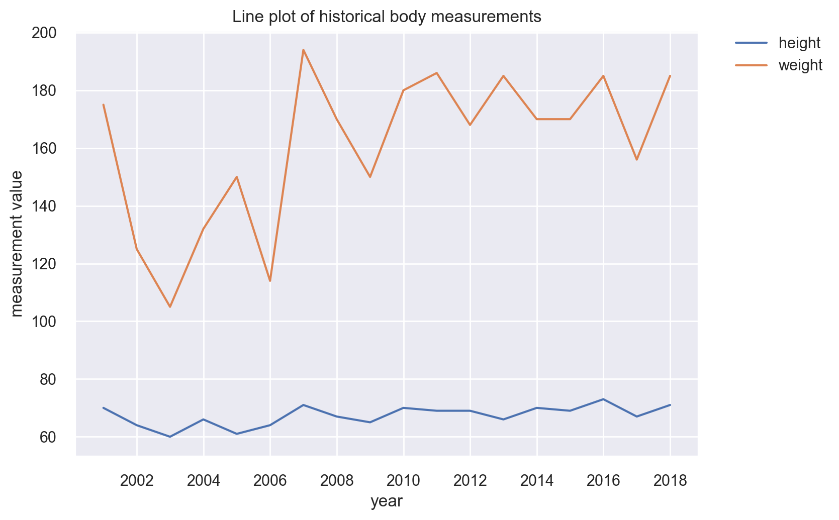
Line Plots#
Our BRFSS dataset does not really allow for any meaningful line plots, so we will cook up a scenario for one. We will take the first 18 rows and pretend that they are measurements for the past 18 years.
cdc_series = pd.DataFrame(
    {
        "time": pd.date_range("2000-12-31", periods=18, freq="12M"),
        "height": cdc["height"].iloc[0:18],
        "weight": cdc["weight"].iloc[0:18],
    }
)

cdc_series.head()
| time | height | weight | |
|---|---|---|---|
| 0 | 2000-12-31 | 70 | 175 |
| 1 | 2001-12-31 | 64 | 125 |
| 2 | 2002-12-31 | 60 | 105 |
| 3 | 2003-12-31 | 66 | 132 |
| 4 | 2004-12-31 | 61 | 150 |
# move the height and weight columns to rows
# using the melt() Pandas function:

cdc_series_long = pd.melt(
    cdc_series, id_vars=["time"], var_name="measurement_type", value_name="values"
)

cdc_series_long.sample(5, random_state=1)
| time | measurement_type | values | |
|---|---|---|---|
| 30 | 2012-12-31 | weight | 185 |
| 34 | 2016-12-31 | weight | 156 |
| 28 | 2010-12-31 | weight | 186 |
| 3 | 2003-12-31 | height | 66 |
| 19 | 2001-12-31 | weight | 125 |
lp = sns.lineplot(x="time", y="values", hue="measurement_type", data=cdc_series_long)

# position the legend outside the chart
lp.legend(bbox_to_anchor=(1.05, 1), loc=2, borderaxespad=0.0)

# add a title and axes labels
lp.set(
    title="Line plot of historical body measurements",
    xlabel="year",
    ylabel="measurement value",
)
[Text(0.5, 1.0, 'Line plot of historical body measurements'),
 Text(0.5, 0, 'year'),
 Text(0, 0.5, 'measurement value')]
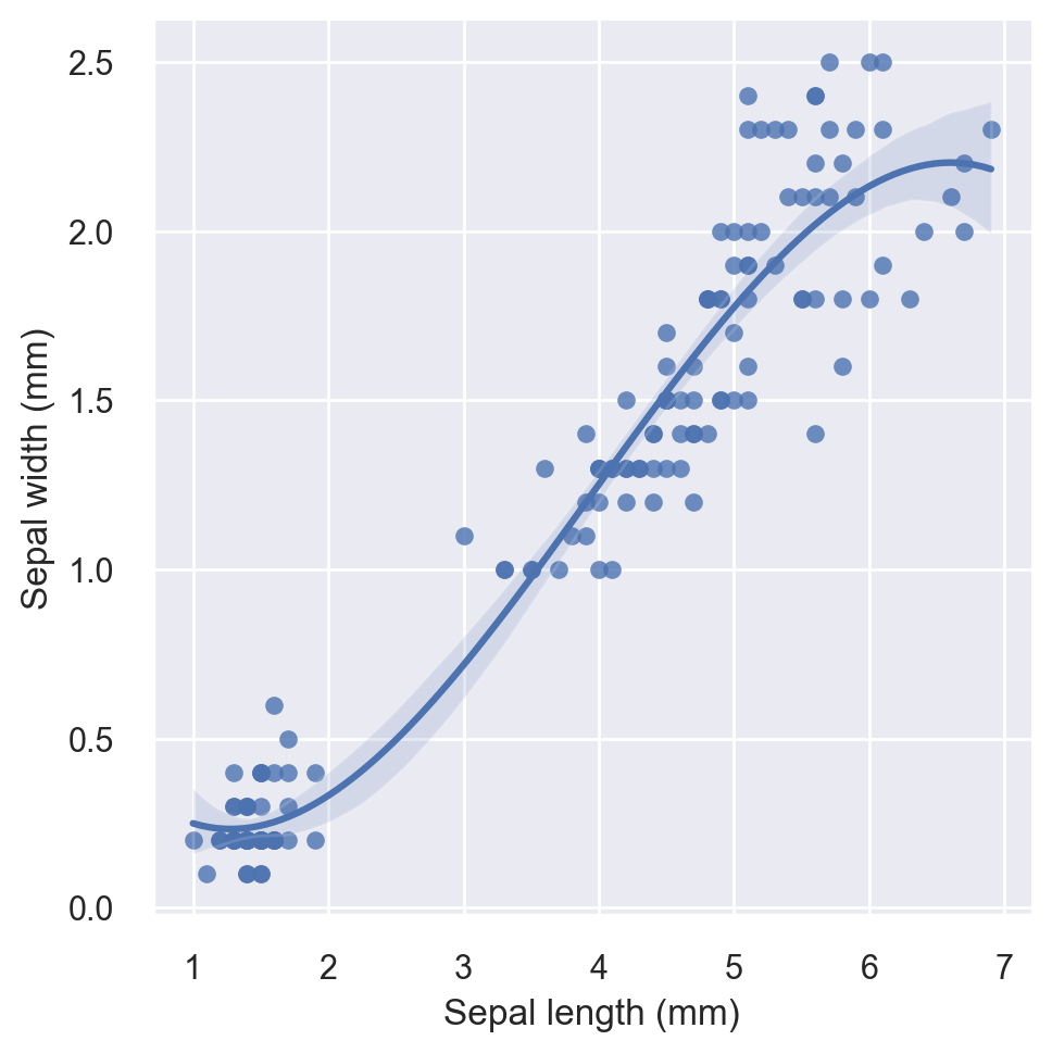
Regression Plots#
Seaborn provides an easy interface for regression plots via the lmplot() function. For illustration, we will use the famous iris flower data set, which is available within the Seaborn module.
A diagram of iris flower parts is shown below (source: US Forest Services).

# load the iris dataset
iris = sns.load_dataset("iris")
iris.sample(10, random_state=999)
| sepal_length | sepal_width | petal_length | petal_width | species | |
|---|---|---|---|---|---|
| 61 | 5.9 | 3.0 | 4.2 | 1.5 | versicolor |
| 64 | 5.6 | 2.9 | 3.6 | 1.3 | versicolor |
| 80 | 5.5 | 2.4 | 3.8 | 1.1 | versicolor |
| 40 | 5.0 | 3.5 | 1.3 | 0.3 | setosa |
| 36 | 5.5 | 3.5 | 1.3 | 0.2 | setosa |
| 0 | 5.1 | 3.5 | 1.4 | 0.2 | setosa |
| 44 | 5.1 | 3.8 | 1.9 | 0.4 | setosa |
| 82 | 5.8 | 2.7 | 3.9 | 1.2 | versicolor |
| 126 | 6.2 | 2.8 | 4.8 | 1.8 | virginica |
| 17 | 5.1 | 3.5 | 1.4 | 0.3 | setosa |
iris["species"].value_counts()
species
setosa        50
versicolor    50
virginica     50
Name: count, dtype: int64
First let’s plot petal width vs. petal length without breaking by the species. We will do a scatter plot overlayed with a third-order regression fit.
g = sns.lmplot(x="petal_length", y="petal_width", order=3, data=iris)

# set axis labels
g.set_axis_labels("Sepal length (mm)", "Sepal width (mm)")
<seaborn.axisgrid.FacetGrid at 0x1124592d0>
Let’s now break the above regression plot with respect to the species variable and fit a first-order regression to each species’ respective data points in the plot.
g = sns.lmplot(
    x="petal_length", y="petal_width", hue="species", truncate=True, height=8, data=iris
)

# set axis labels
g.set_axis_labels("Sepal length (mm)", "Sepal width (mm)")
<seaborn.axisgrid.FacetGrid at 0x1132b2410>
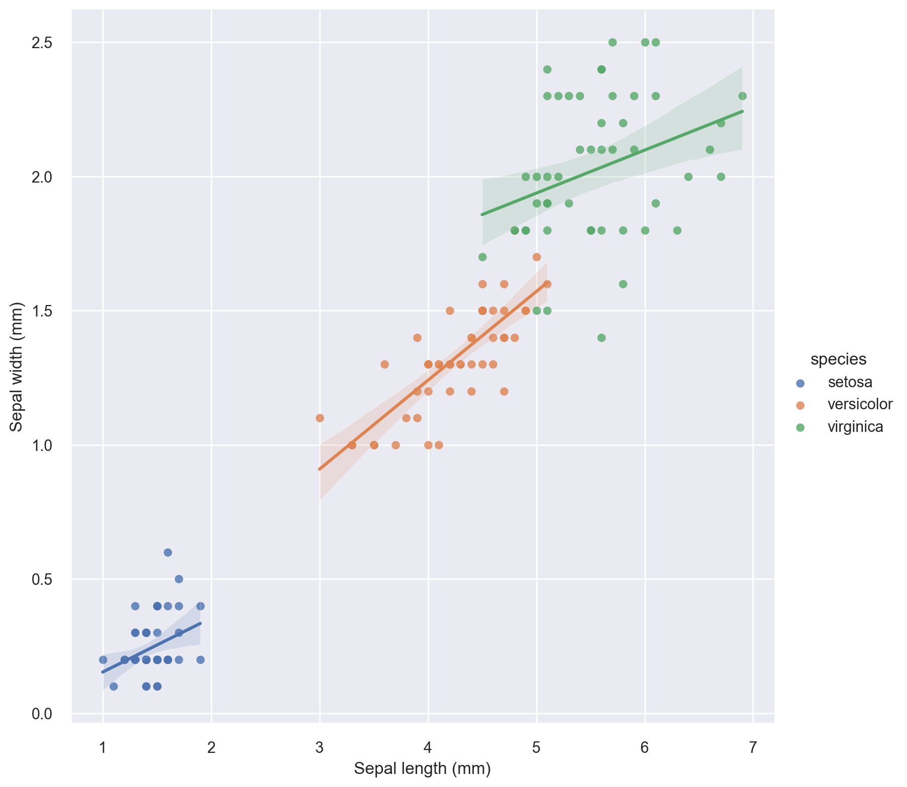
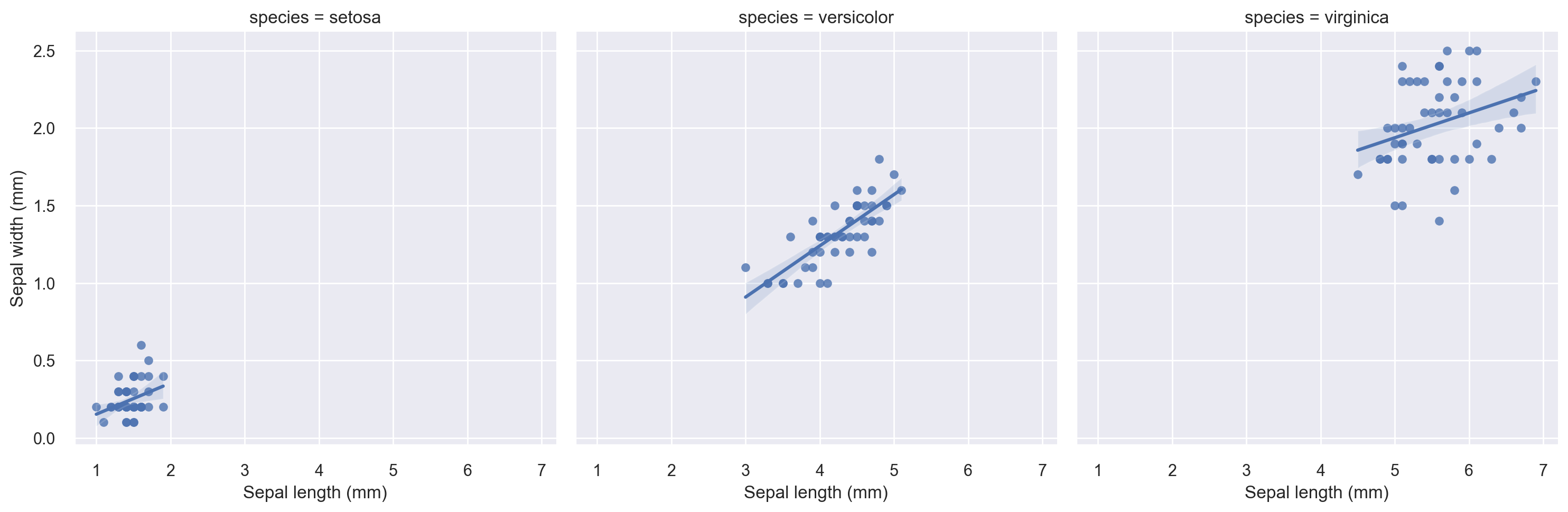
The above plot indicates that breaking the plot by species seems to be a good idea in terms of a regression fit. Let’s do a faceted regression plot using the species variable as the column parameter.
g = sns.lmplot(
    x="petal_length", y="petal_width", col="species", truncate=True, data=iris
)

# set axis labels
g.set_axis_labels("Sepal length (mm)", "Sepal width (mm)")
<seaborn.axisgrid.FacetGrid at 0x11330ee50>
Scatter Plot Matrices#
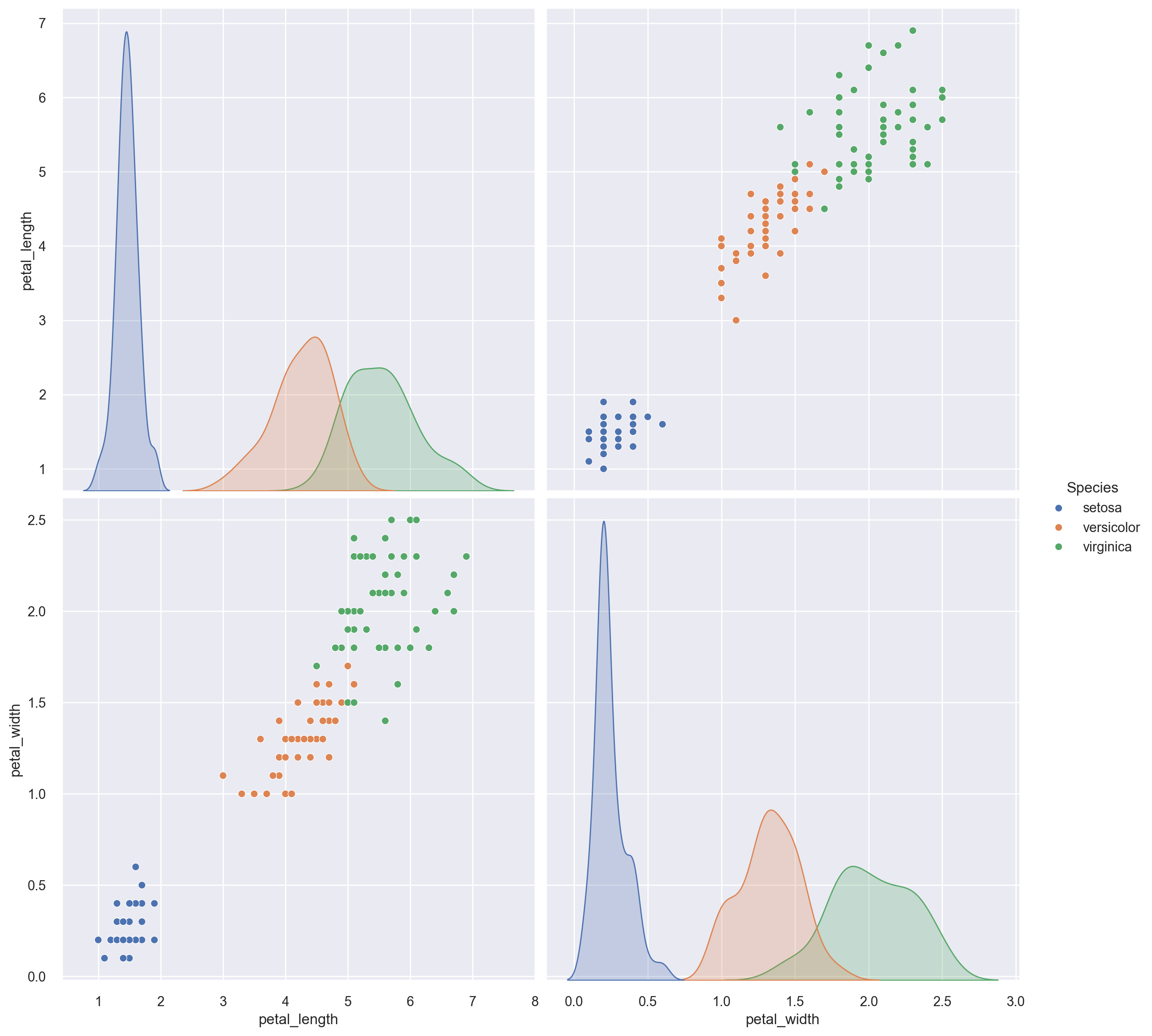
Let’s get a pairwise scatterplot matrix for all the petal length and petal width variables in the iris dataset sliced and diced by the species variable.
sp = sns.pairplot(iris, vars=["petal_length", "petal_width"], height=6, hue="species")

# change the legend title
sp._legend.set_title("Species")
Seaborn is far more capable than what is illustrated in this short tutorial. For more details, please refer to the official API page here.