Matplotlib#
Matplotlib is a Python plotting module which produces publication quality figures in a variety of formats (jpg, png, etc). In this tutorial, we explore the use of Matplotlib for creating visualisations in Python.
We cover basic plotting techniques, including line plots with customisable styles, colours, and markers. We demonstrate how to create multiple plots within a single figure using subplots and provide detailed instructions on customising plots with titles, labels, legends, and annotations.
Table of Contents#
Plotting your first graph#
Let’s import Matplotlib library. When running Python using the command line, the graphs are typically shown in a separate window. In a Jupyter Notebook, you can simply output the graphs within the notebook itself by running the %matplotlib inline magic command.
You can change the format to svg for better quality figures. You can also try the retina format and see which one looks better on your computer’s screen.
You can also change the default style of plots. Let’s go with our favourite style seaborn.
import numpy as np
import matplotlib.pyplot as plt

%matplotlib inline
%config InlineBackend.figure_format = 'retina'

plt.style.use("seaborn-v0_8")
Now let’s plot our first graph. We use the plot function to create the plot and we use the show function to display the plot. We place a semi-colon at the end of the show function to suppress the actual output of this function, which is not very useful as it looks something like matplotlib.lines.Line2D at 0x11a05e2e8.
plt.plot([1, 2, 4, 7, 5, 4])
plt.show();
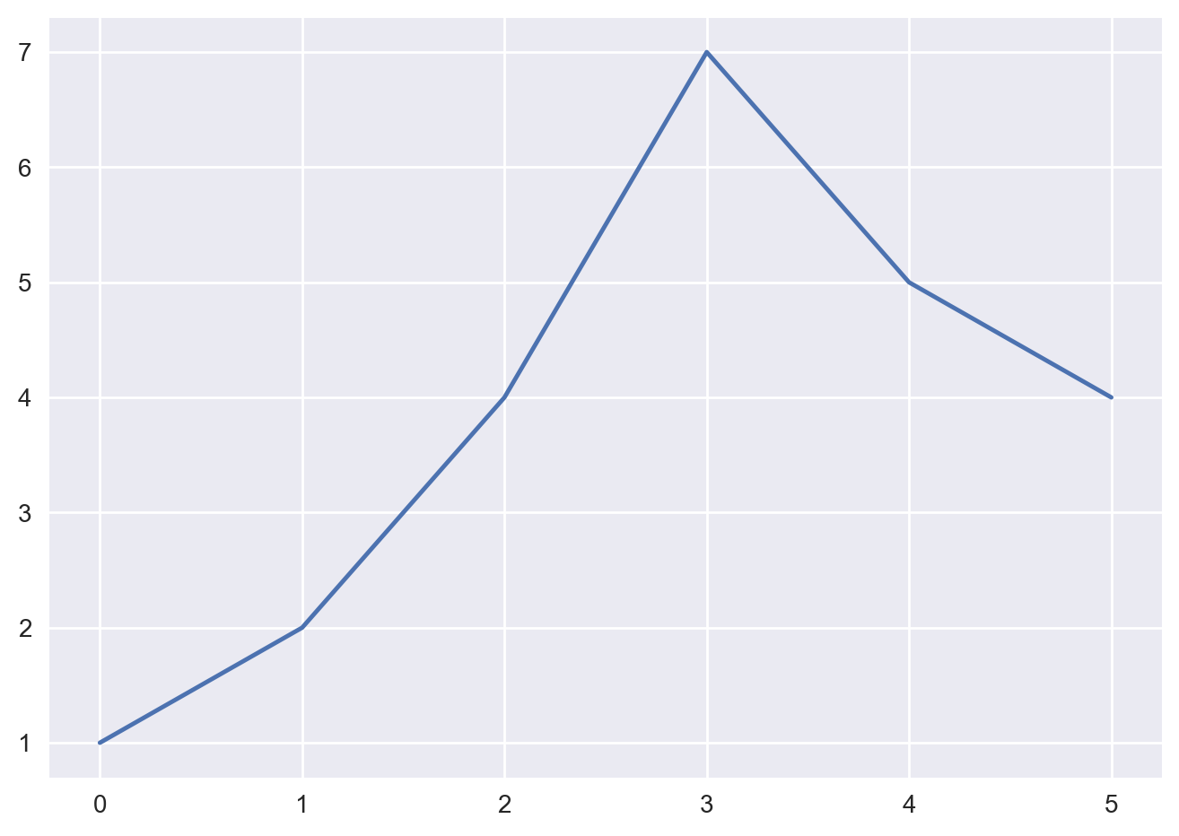
So, it’s as simple as calling the plot function with some data, and then calling the show function. If the plot function is given one array of data, it will use it as the coordinates on the vertical axis, and it will just use each data point’s index in the array as the horizontal coordinate.
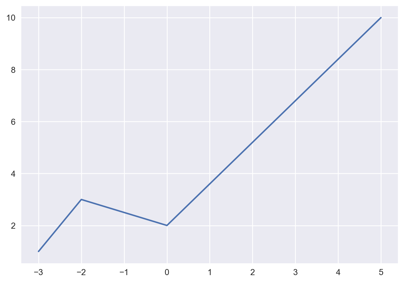
You can also provide two arrays: one for the horizontal axis x, and the second for the vertical axis y.
plt.plot([-3, -2, 0, 5], [1, 3, 2, 10])
plt.show();
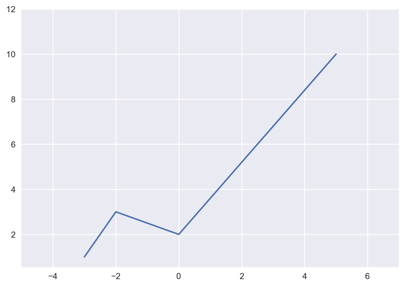
The axes automatically match the extent of the data. We would like to give the graph a bit more room, so let’s call the xlim and ylimfunctions to change the extent of each axis. Here, you can also specify a value of “None” for the default limit.
plt.plot([-3, -2, 0, 5], [1, 3, 2, 10])
plt.xlim(-5, 7)
plt.ylim(None, 12)
plt.show();
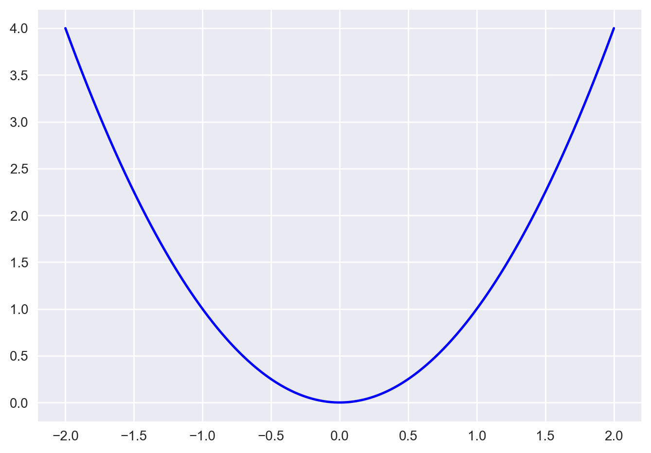
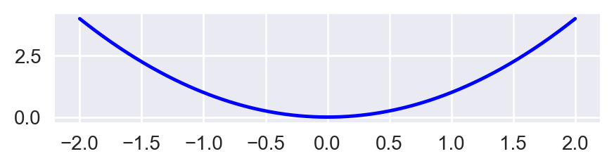
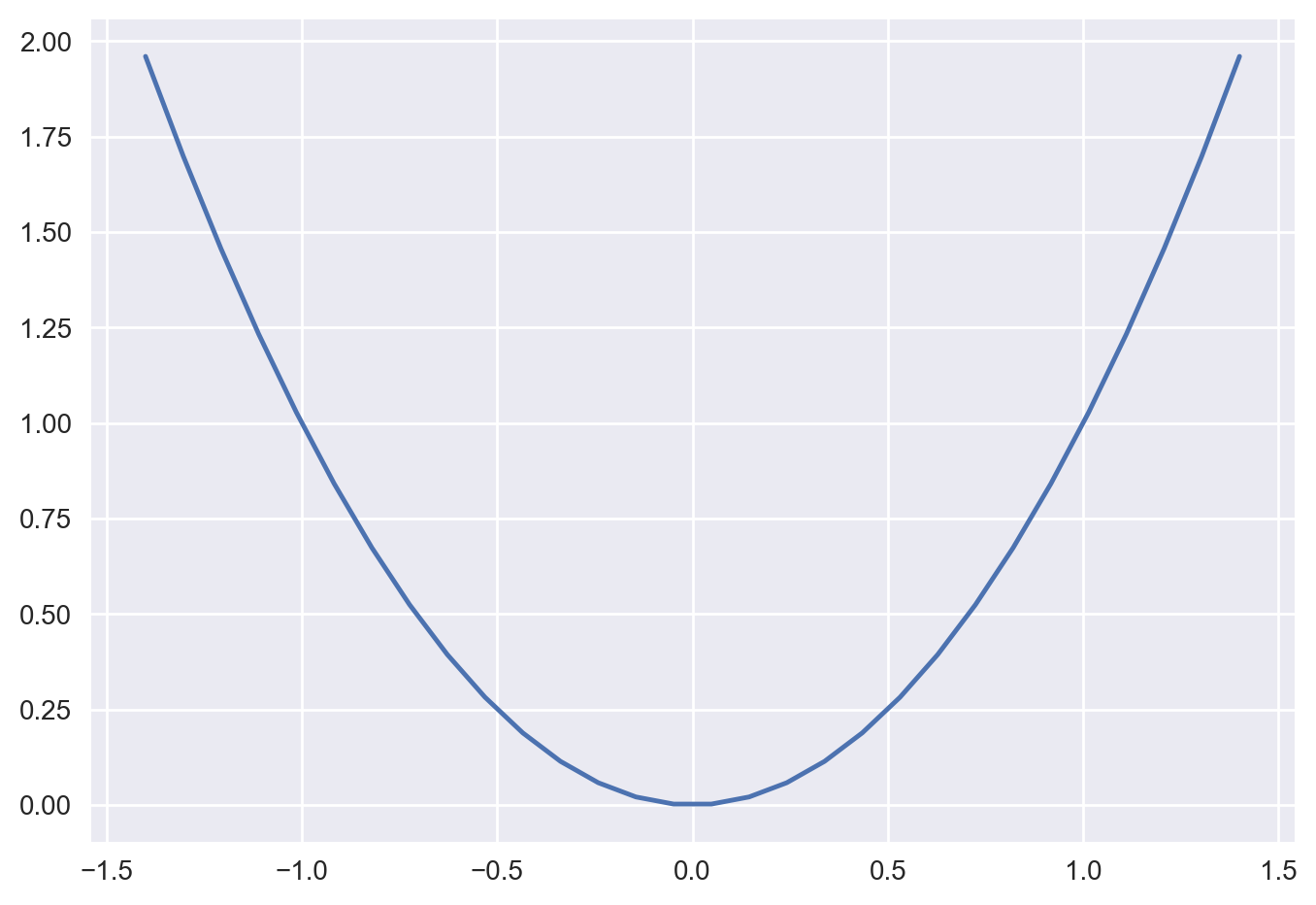
Now, let’s plot a mathematical function. We use NumPy’s linspace function to create an array x containing 500 floats ranging from -2 to 2, then we create a second array y computed as the square of x. While at it, we change the color to blue from the default style color red.
x = np.linspace(-2, 2, 500)
y = x**2
plt.plot(x, y, color='blue')
plt.show();
Changing figure size & adding labels#
To change the size of the plot, please see below where the figure size is assumed to be in inches.
plt.figure(figsize = (5, 1))
plt.plot(x, y, color='blue')
plt.show();
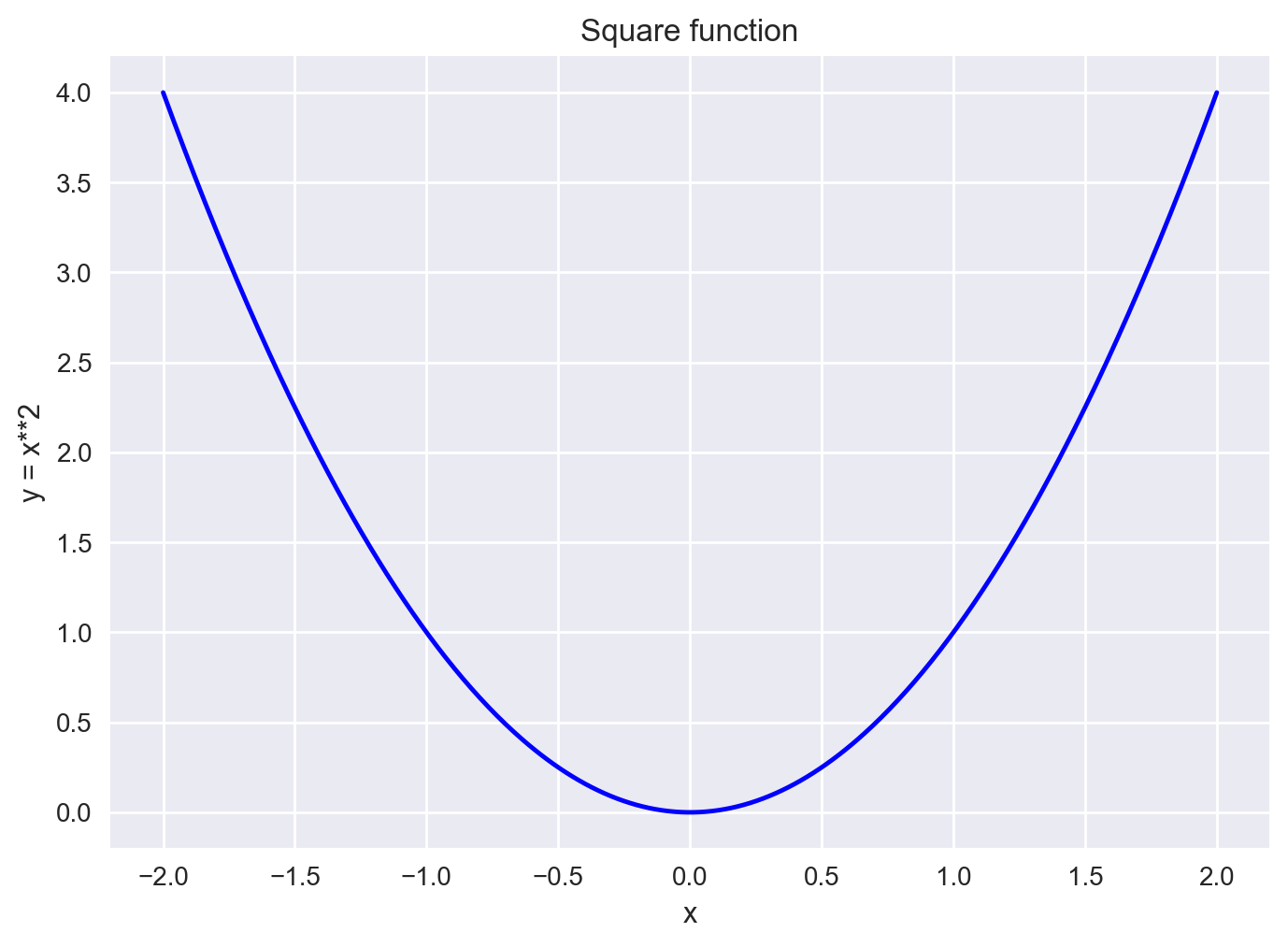
The plot above is a bit dry, so let’s add a title, x and y labels, and also draw a grid.
In this particular case, since we are using the seaborn style, we get the grid for free, but in the default case, you can use the grid function for displaying a grid.
plt.plot(x, y, color='blue')
plt.title("Square function")
plt.xlabel("x")
plt.ylabel("y = x**2")
plt.grid(True)
plt.show();
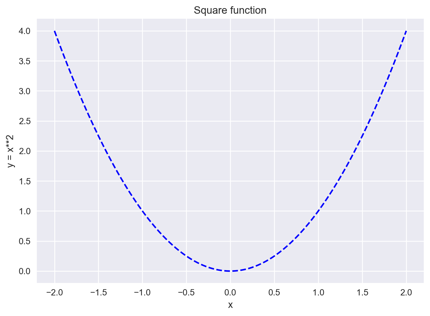
Line style and color#
By default, matplotlib draws a line between consecutive points. You can pass a 3rd argument to change the line’s style and color. For example "b--" means “blue dashed line”.
plt.plot(x, y, 'b--')
plt.title("Square function")
plt.xlabel("x")
plt.ylabel("y = x**2")
plt.show();
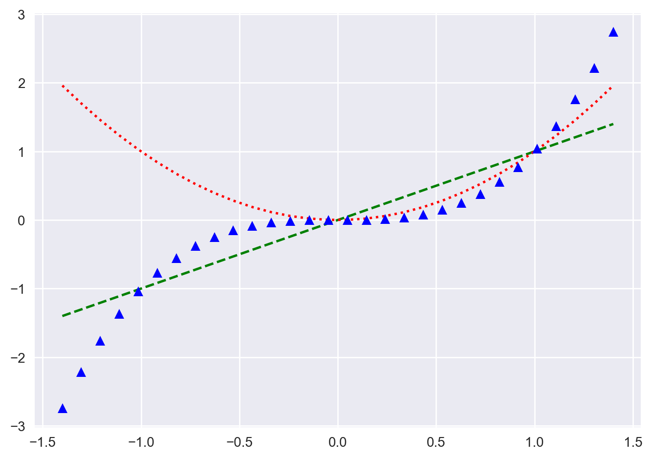
You can easily plot multiple lines on one graph. You simply call plot multiple times before calling show.
You can also draw simple points instead of lines. Here’s an example with green dashes, red dotted line and blue triangles.
Check out the documentation for the full list of style & color options.
x = np.linspace(-1.4, 1.4, 30)
plt.plot(x, x, 'g--')
plt.plot(x, x**2, 'r:')
plt.plot(x, x**3, 'b^')
plt.show();
For each plot line, you can set extra attributes, such as the line width, the dash style, or the alpha level. See the full list of attributes in the documentation. You can also overwrite the current style’s grid options using the grid function.
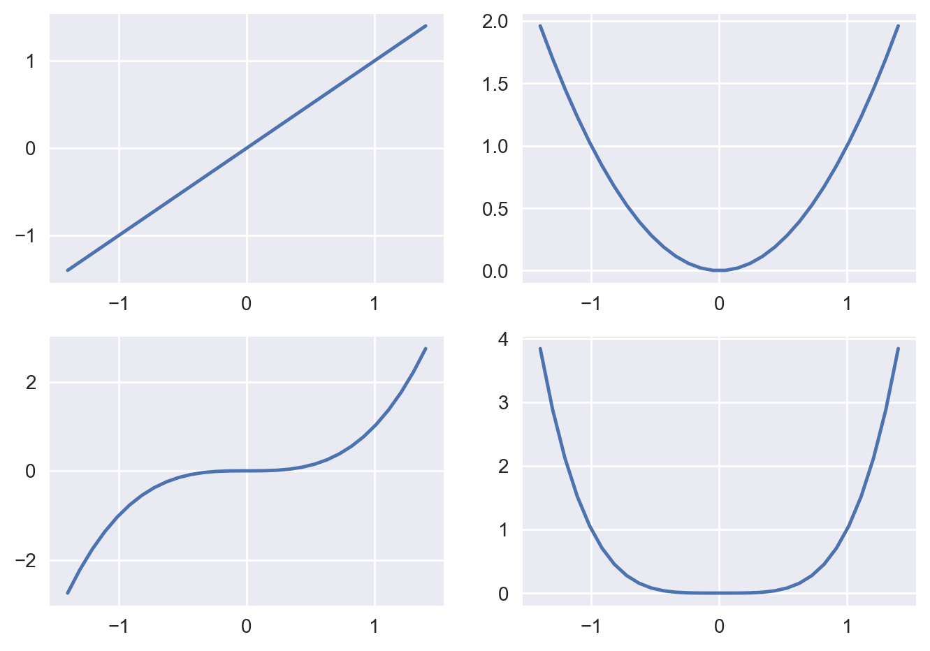
Subplots#
A Matplotlib figure may contain multiple subplots. These subplots are organized in a grid. To create a subplot, just call the subplot function, specify the number of rows and columns in the figure, and the index of the subplot you want to draw on (starting from 1, then left to right, and top to bottom).
x = np.linspace(-1.4, 1.4, 30)
plt.subplot(2, 2, 1)  # 2 rows, 2 columns, 1st subplot = top left
plt.plot(x, x)
plt.subplot(2, 2, 2)  # 2 rows, 2 columns, 2nd subplot = top right
plt.plot(x, x**2)
plt.subplot(2, 2, 3)  # 2 rows, 2 columns, 3rd subplot = bottow left
plt.plot(x, x**3)
plt.subplot(2, 2, 4)  # 2 rows, 2 columns, 4th subplot = bottom right
plt.plot(x, x**4)
plt.show();
It is easy to create subplots that span across multiple grid cells.
plt.subplot(2, 2, 1)  # 2 rows, 2 columns, 1st subplot = top left
plt.plot(x, x)
plt.subplot(2, 2, 2)  # 2 rows, 2 columns, 2nd subplot = top right
plt.plot(x, x**2)
plt.subplot(2, 1, 2)  # 2 rows, *1* column, 2nd subplot = bottom
plt.plot(x, x**3)
plt.show();
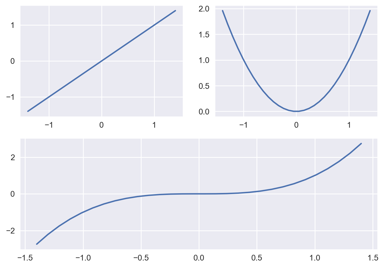
If you need even more flexibility in subplot positioning, check out the GridSpec documentation.
Text and annotations#
You can call text to add text at any location in the graph. Just specify the horizontal and vertical coordinates and the text, and optionally some extra attributes. Any text in matplotlib may contain TeX equation expressions, see the documentation for more details. Below, ha is an alias for horizontalalignment.
x = np.linspace(-1.5, 1.5, 30)
px = 0.8
py = px**2

plt.plot(x, x**2, "b-", px, py, "ro")

plt.text(0, 1.5, "Square function\n$y = x^2$", fontsize=15, color='blue', horizontalalignment="center")
plt.text(px, py, "x = %0.2f\ny = %0.2f"%(px, py), rotation=50, color='gray')

plt.show();
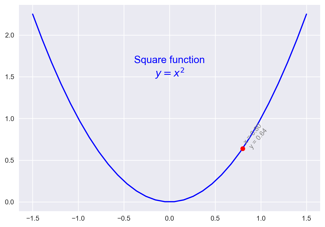
For more text properties, visit the documentation.
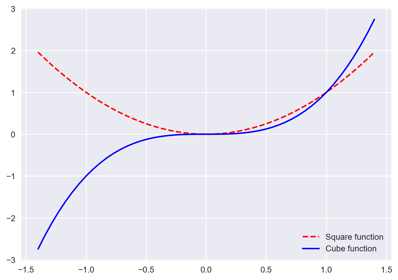
Labels and legends#
The simplest way to add a legend is to set a label on all lines, then just call the legend function.
x = np.linspace(-1.4, 1.4, 50)
plt.plot(x, x**2, "r--", label="Square function")
plt.plot(x, x**3, "b-", label="Cube function")
plt.legend(loc="lower right")
plt.show();
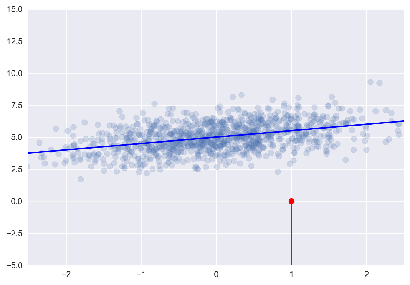
Lines#
You can draw lines simply using the plot function. However, it is often convenient to create a utility function that plots a (seemingly) infinite line across the graph, given a slope and an intercept. You can also use the hlines and vlines functions that plot horizontal and vertical line segments.
def plot_line(axis, slope, intercept, **kargs):
    xmin, xmax = axis.get_xlim()
    plt.plot([xmin, xmax], [xmin*slope+intercept, xmax*slope+intercept], **kargs)

x = np.random.randn(1000)
y = 0.5*x + 5 + np.random.randn(1000)
plt.axis([-2.5, 2.5, -5, 15])
plt.scatter(x, y, alpha=0.2)
plt.plot(1, 0, "ro")  # red colid circle
plt.vlines(1, -5, 0, color="green", linewidth=0.75)
plt.hlines(0, -2.5, 1, color="green", linewidth=0.75)
plot_line(axis=plt.gca(), slope=0.5, intercept=5, color="blue")
plt.grid(True)
plt.show();
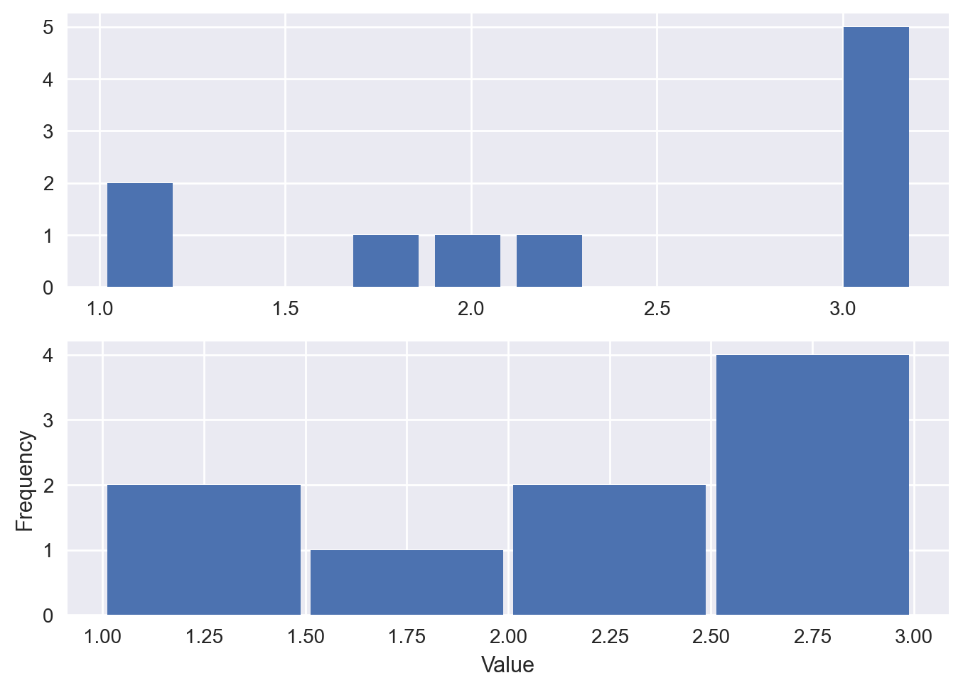
Histograms#
You can plot histograms using the hist function.
data = [1, 1.1, 1.8, 2, 2.1, 3.2, 3, 3, 3, 3]
plt.subplot(2,1,1)
plt.hist(data, bins = 10, rwidth=0.8)

plt.subplot(2,1,2)
plt.hist(data, bins = [1, 1.5, 2, 2.5, 3], rwidth=0.95)
plt.xlabel("Value")
plt.ylabel("Frequency")

plt.show();
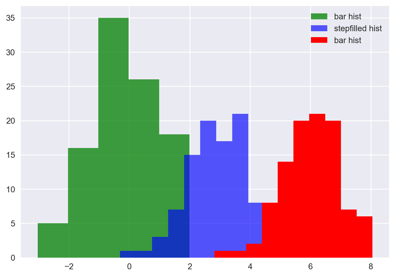
data1 = np.random.randn(100)
data2 = np.random.randn(100) + 3
data3 = np.random.randn(100) + 6

plt.hist(data1, bins=5, color='g', alpha=0.75, label='bar hist') # default histtype='bar'
plt.hist(data2, color='b', alpha=0.65, histtype='stepfilled', label='stepfilled hist')
plt.hist(data3, color='r', label='bar hist')

plt.legend()
plt.show();
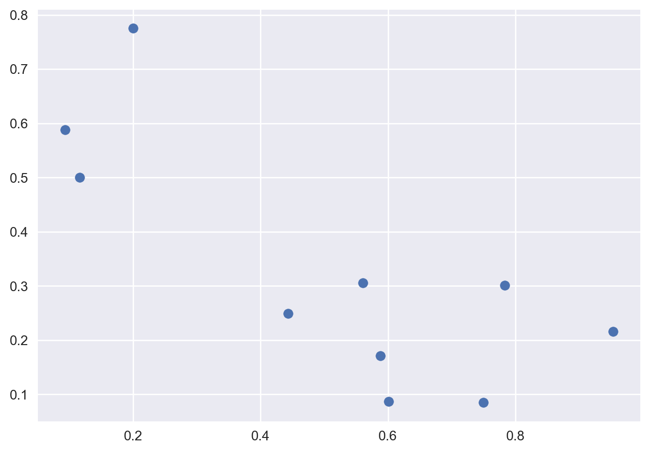
Scatterplots#
To draw a scatterplot, simply provide the x and y coordinates of the points and call the scatter function.
x, y = np.random.rand(2, 10)
plt.scatter(x, y)
plt.show();
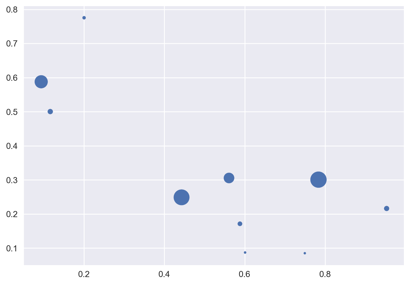
You may also optionally specify the scale of each point.
scale = np.random.rand(10)
scale = 500 * scale ** 2
plt.scatter(x, y, s=scale)
plt.show();
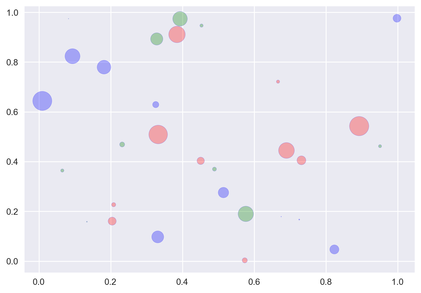
As usual, there are a number of other attributes you can set, such as the fill and edge colors and the alpha level.
for color in ['red', 'green', 'blue']:
    n = 10
    x, y = np.random.rand(2, n)
    scale = 500.0 * np.random.rand(n) ** 2
    plt.scatter(x, y, s=scale, c=color, alpha=0.3, edgecolors='blue')

plt.show();
Boxplots#
Boxplots can be displayed using the boxplot function.
data1 = np.random.rand(10)*2 + 5
plt.boxplot(x=data1)
plt.title("Boxplot")
plt.show();

Saving a figure#
Saving a figure to disk is as simple as calling savefig with the name of the file (or a file object). The available image formats depend on the graphics backend you use.
x = np.linspace(-1.4, 1.4, 30)
plt.plot(x, x**2)
plt.savefig("my_square_function.png", transparent=True);
Exercises#
Using records of undergraduate degrees awarded to women in a variety of fields from 1970 to 2011, compare trends in degrees most easily by viewing two curves on the same set of axes:
You should first create three NumPy arrays for the following ones:
year (which enumerates years from 1970 to 2011 inclusive),
physical_sciences (which represents the percentage of Physical Sciences degrees awarded to women each in corresponding year),
# Use the following values for physical_sciences
physical_sciences = [13.8, 14.9, 14.8, 16.5, 18.2, 19.1, 20, 21.3, 22.5, 23.7, 24.6, 25.7, 27.3, 27.6, 28, 27.5, 28.4, 30.4, 29.7, 31.3, 31.6, 32.6, 32.6, 33.6, 34.8, 35.9, 37.3, 38.3, 39.7, 40.2, 41, 42.2, 41.1, 41.7, 42.1, 41.6, 40.8, 40.7, 40.7, 40.7, 40.2, 40.1]
computer_science (which represents the percentage of Computer Science degrees awarded to women in each corresponding year).
# Use the following values for computer_science
computer_science = [13.6, 13.6, 14.9, 16.4, 18.9, 19.8, 23.9, 25.7, 28.1, 30.2, 32.5, 34.8, 36.3, 37.1, 36.8, 35.7, 34.7, 32.4, 30.8, 29.9, 29.4, 28.7, 28.2, 28.5, 28.5, 27.5, 27.1, 26.8, 27, 28.1, 27.7, 27.6, 27, 25.1, 22.2, 20.6, 18.6, 17.6, 17.8, 18.1, 17.6, 18.2]
Create two
plt.plotcommands to draw line plots of different colors on the same set of axes(yearrepresents the x-axis, whilephysical_sciencesandcomputer_scienceare the y-axes):
Add a
blueline plot of the % of degrees awarded to women in the Physical Sciences from 1970 to 2011.
HINT: the x-axis should be specified first.
Add a
redline plot of the % of degrees awarded to women in Computer Science from 1970 to 2011.
Use
plt.subplotto create a figure with 1x2 subplot layout & make the first subplot active.
Plot the percentage of degrees awarded to women in Physical Sciences in
bluein the active subplot.
Use
plt.subplotagain to make the second subplot active in the current 1x2 subplot grid.
Plot the percentage of degrees awarded to women in Computer Science in
redin the active subplot.
Add labels and title.
Add a legend at the lower center.
Save the output to “scientist_women.png”.
Possible solutions#
# Import numpy
import numpy as np

# Create NumPy arrays for three variables
physical_sciences = np.array([13.8, 14.9, 14.8, 16.5, 18.2, 19.1, 20. , 21.3, 22.5, 23.7, 24.6, 25.7, 27.3, 27.6, 28. , 27.5, 28.4, 30.4, 29.7, 31.3, 31.6, 32.6, 32.6, 33.6, 34.8, 35.9, 37.3, 38.3, 39.7, 40.2, 41. , 42.2, 41.1, 41.7, 42.1, 41.6, 40.8, 40.7, 40.7, 40.7, 40.2, 40.1])
computer_science = np.array([13.6, 13.6, 14.9, 16.4, 18.9, 19.8, 23.9, 25.7, 28.1, 30.2, 32.5, 34.8, 36.3, 37.1, 36.8, 35.7, 34.7, 32.4, 30.8, 29.9, 29.4, 28.7, 28.2, 28.5, 28.5, 27.5, 27.1, 26.8, 27, 28.1, 27.7, 27.6, 27, 25.1, 22.2, 20.6, 18.6, 17.6, 17.8, 18.1, 17.6, 18.2])
year = np.arange(1970, 2012)

# Import matplotlib.pyplot
import matplotlib.pyplot as plt

# Plot in blue the % of degrees awarded to women in the Physical Sciences
plt.plot(year, physical_sciences, color = 'blue')

# Plot in red the % of degrees awarded to women in Computer Science
plt.plot(year, computer_science, color = 'red')

# Display the plot
plt.show()

# Create a figure with 1x2 subplot and make the left subplot active
plt.subplot(1, 2, 1)

# Plot in blue the % of degrees awarded to women in the Physical Sciences
plt.plot(year, physical_sciences, color='blue')
plt.title('Physical Sciences')

# Make the right subplot active in the current 1x2 subplot grid
plt.subplot(1, 2, 2)

# Plot in red the % of degrees awarded to women in Computer Science
plt.plot(year, computer_science, color='red')
plt.title('Computer Science')

# Use plt.tight_layout() to improve the spacing between subplots
plt.tight_layout()

# Display the plot
plt.show();

# Plot the % of degrees awarded to women in Computer Science and the Physical Sciences
plt.plot(year,computer_science, color='red')
plt.plot(year, physical_sciences, color='blue')

# Add the axis labels
plt.xlabel('Year')
plt.ylabel('Degrees awarded (%)')

# Add a title and display the plot
plt.title('Degrees awarded to women (1990-2010)')

# Specify the label 'Computer Science'
plt.plot(year, computer_science, color='red', label='Computer Science')

# Specify the label 'Physical Sciences'
plt.plot(year, physical_sciences, color='blue', label='Physical Sciences')

# Add a legend at the lower center
plt.legend(loc='lower center')

# Save the image as 'scientist_women.png'
plt.savefig("scientist_women.png")